Chapter 15 - Relations as Graphs - Network Analysis
Review of terminology
What do the following terms mean?
- graph
- vertex and edge
- directed and undirected
Graph examples from the course notes
- Shipping records among U.S. states (to be analyzed in class today)
- Dolphin socialization records
- Google's model of all web links
- Small network of friends and advice
Another graph example: Data Flow Diagrams
Example using the free software Knime (which is similar to the commercial software Tableau Prep):
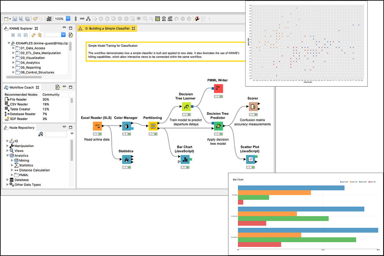
Another graph example: Data Flow Diagrams
This shows how to use Knime for one of the projects in MA346 in Spring 2020.
Review of data storage
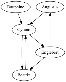
Explain each of the following ways to store graph data in a table, based on the friends-and-advice example from the course notes.
| Augustus | Beatriz | Cyrano | Dauphine | Englebert | |
|---|---|---|---|---|---|
| Augustus | False | False | True | False | False |
| Beatriz | False | False | True | False | False |
| Cyrano | False | True | False | False | True |
| Dauphine | False | False | True | False | False |
| Englebert | True | True | False | False | False |
| From | To |
|---|---|
| Augustus | Cyrano |
| Beatriz | Cyrano |
| Cyrano | Beatriz |
| Cyrano | Englebert |
| Dauphine | Cyrano |
| Englebert | Augustus |
| Englebert | Beatriz |
Discussion
Given a DataFrame df that contains an edge list, how would we do each of the following things?
- Add an edge to the list
- Remove an edge from the list
- Compute the collection of vertices that you can get to in just one step from a given starting vertex
- Compute the collection of vertices that can get, in just one step, to a given destination vertex
Practice with NetworkX
Most of today will be spent on an extended exercise in loading and visualizing the 1997 shipping dataset you prepared for today in homework.
Step 1
Open the notebook or script you created for homework, which loads and manipulates the shipping data.
Add the code to import networkx as nx and ensure that it succeeds.
Step 2
Some of the shipping data that should be numeric is expressed as text, using either "S", "-", or an empty string instead of a measurement for value, tons, or ton-miles. Clean up the data so that all of these symbols become missing values instead.
The dataset uses 0 as the code to mean "all commodities combined." We will focus exclusively on these measurements, rather than on individual commodities. Filter the shipping table so that it keeps only those records and discards the rest.
Step 3
Merge the shipping data and the information about distance and adjacency between states, so that you create a table with the following format.
| origin | dest | Value($ mil) | Tons(000) | Ton-miles(mil) | Distance(km) | adjacent | |
|---|---|---|---|---|---|---|---|
| 0 | AK | AK | 5376 | 17448 | 2624 | 64.0919 | 1 |
| 1 | AK | AL | nan | nan | nan | 4581.72 | 0 |
| 2 | AK | AR | nan | nan | nan | 4036.35 | 0 |
| 3 | AK | AZ | nan | nan | nan | 3217.3 | 0 |
| 4 | AK | CA | nan | nan | nan | 2387.07 | 0 |
Step 4
Convert the above shipping data into a format suitable for use in creating a directed graph among the states.
- Recall that you create a new, empty, directed graph in NetworkX using
nx.DiGraph(). - See this section of the course notes for a review of how to add nodes and edges to a NetworkX graph.
Verify that your work succeeded by calling len() on your graph object and ensuring that it contains 50 states.
Step 5
Draw your graph with nx.draw().
What's wrong with this approach?
Brainstorm some ideas for how to improve the resulting visualization.
We will discuss them in class, and then implement them.
Step 6
The degree centrality of a graph ranks vertices in the graph just by counting the number of connections they have.
Show the top 10 states in terms of number of trading partners, in decreasing order.
Step 7
Use same shipping data to create a DataFrame that is an edge list for just those states that are adjacent to one another.
Visualize this network using nx.draw(). Does it look anything like the United States?
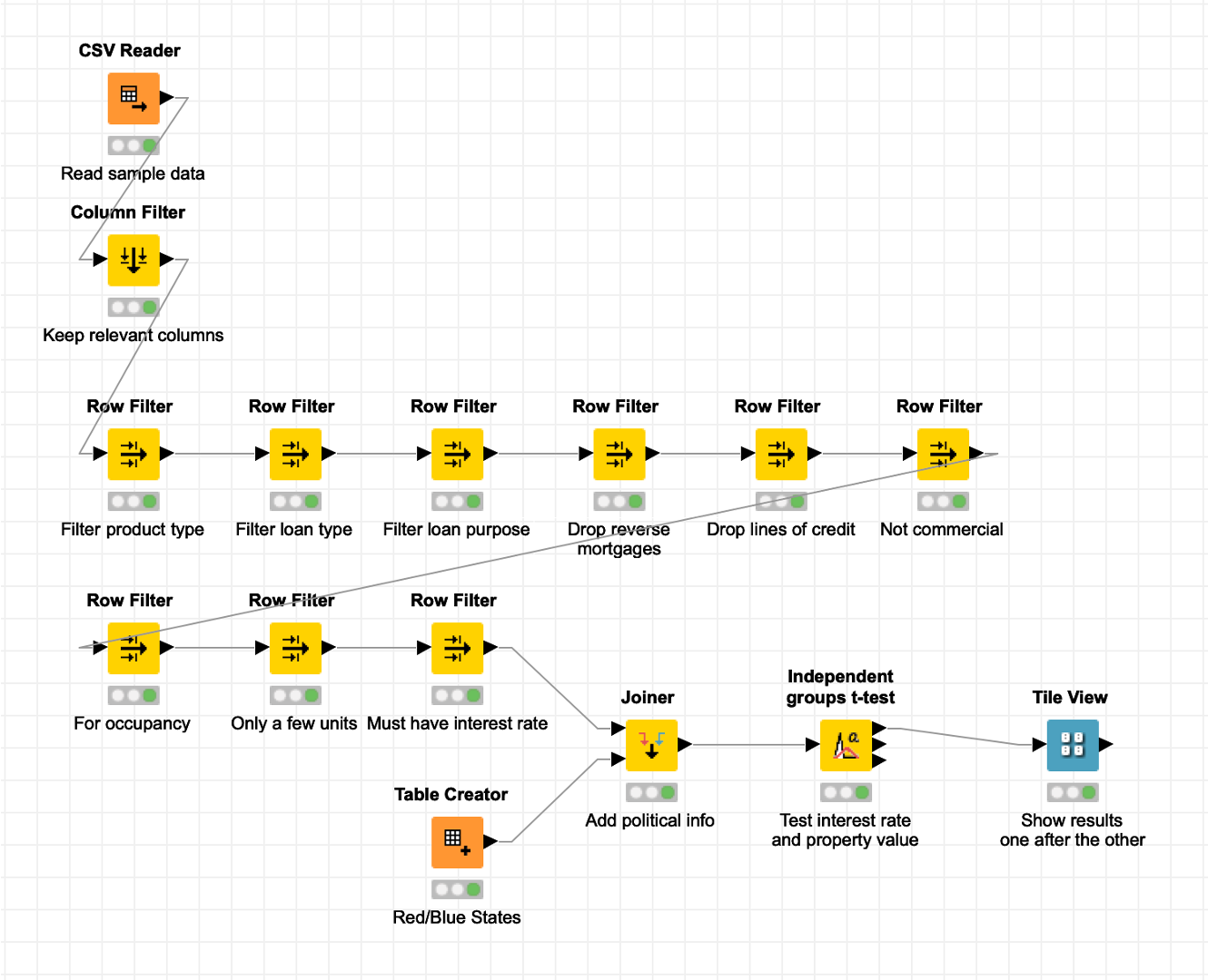
Stepping outside of Python
To experience software that lets you do ETL using data flow diagrams, try this:
- Download the free software Knime from here.
- Redo the homework assignment you prepared for today (manipulating the shipping data) in Knime.
The software is sufficiently intuitive that you probably don't even need instructions!